
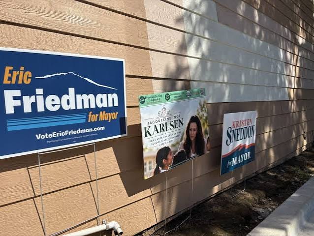
(Editor’s note: House signs represent the most visible means of communication in local political campaigns, so when city election season comes around, we turn to friend and loyal Newsmaker John Roshell for professional insight and judgment on how the candidates shape up. John is a Santa Barbara-based graphic designer who has created hundreds of fonts and logos for the comic book, movie, TV and video game industries - think Black Panther, Daredevil and Angry Birds. Because of his keen eye and discernment, Roshell got recruited into the mayor’s race early this year, as he discloses below, in recounting a behind-the-scenes experience that offers a glimpse of how campaigns operate. -jr).
By John Roshell
With the election a week away, it’s time to focus on the issue that really matters: the graphic design of the candidates’ yard signs. I’m a graphic designer and font creator who’s lived in Santa Barbara for 31 years.
With thanks to the candidates for passing on their images, here’s my assessment of which signs fly, and which fall flat. The criteria, graded from A-F:
Function:
Readable from across the street, or driving by at 30 mph
Too much information, or not enough
Clear hierarchy of information … or big ol’ mess?
Form:
Immediately recognizable
Stands out against other signs
Tells us something about the candidate and/or feels connected to our town
Full disclosure: Unlike the last time I reviewed signs for Newsmakers, this year one of my own is in the mix! You can scroll to the bottom to see it (and give me hell if you like), along with a behind-the-scenes look at the process of creating a campaign sign.
DISTRICT 4
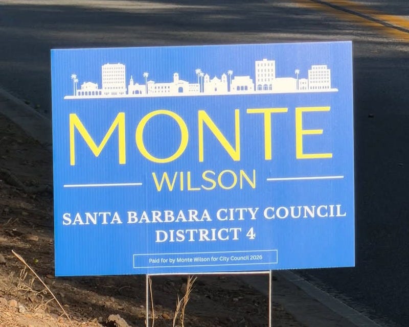
4. Monte Wilson
Function: B
Form: C
Plenty of signs use mountains and ocean waves to signify Santa Barbara, but this is the first I’ve seen that includes a city skyline. Points for originality, but putting the Granada next to the Mission next to the Courthouse feels disorienting.
.The sign is easy to read. But why is his name under the city and not in the sky above it? I know housing is tough to find — is Monte living underground?
The Art Deco type smacks of the “La La Land” movie poster–making this sign perfect for a campaign in Los Angeles … but not here.
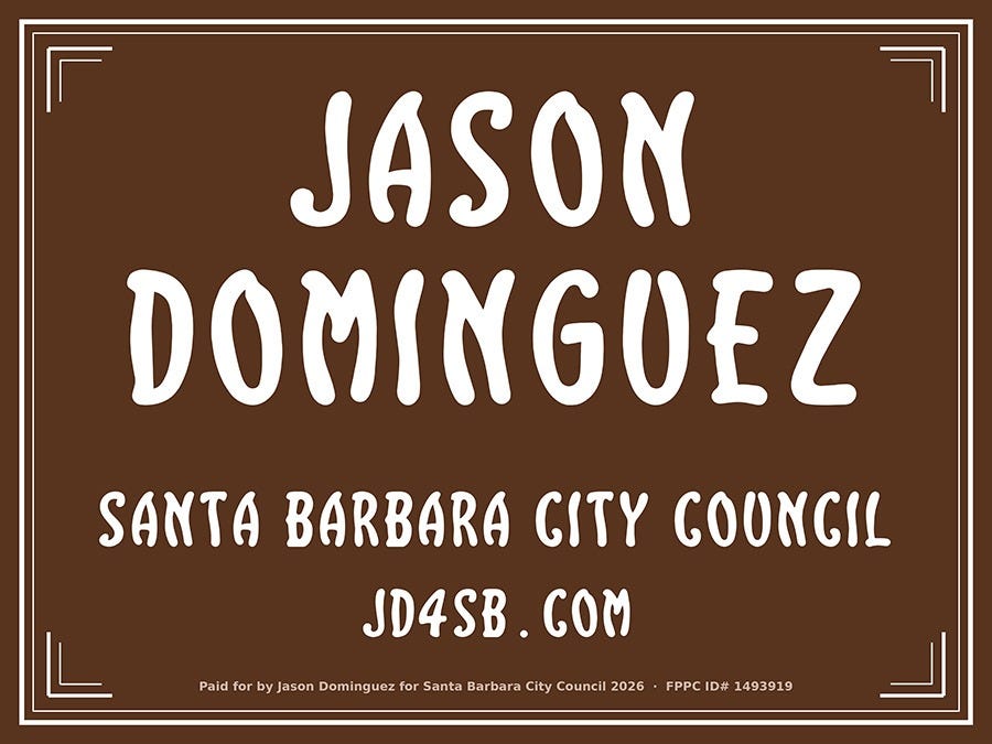
3. Jason Dominguez
Function: B+
Form: A-
On the flip side, you can’t get more visually Santa-Barbara than our street sign font in white on dark brown. But the funny border lines aren’t on the street signs!! If you’re going all in, go ALL IN.
Deleting “Santa Barbara” would make room for a bigger “City Council,” which is more important information.
So close.
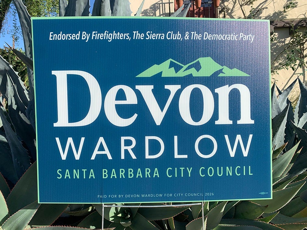
2. Devon Wardlow
Function: A
Form: B+
Very readable. Good color contrast, and perfect hierarchy of info. The mountains add a little visual interest. Nothing risky here, just a practical, effective sign.
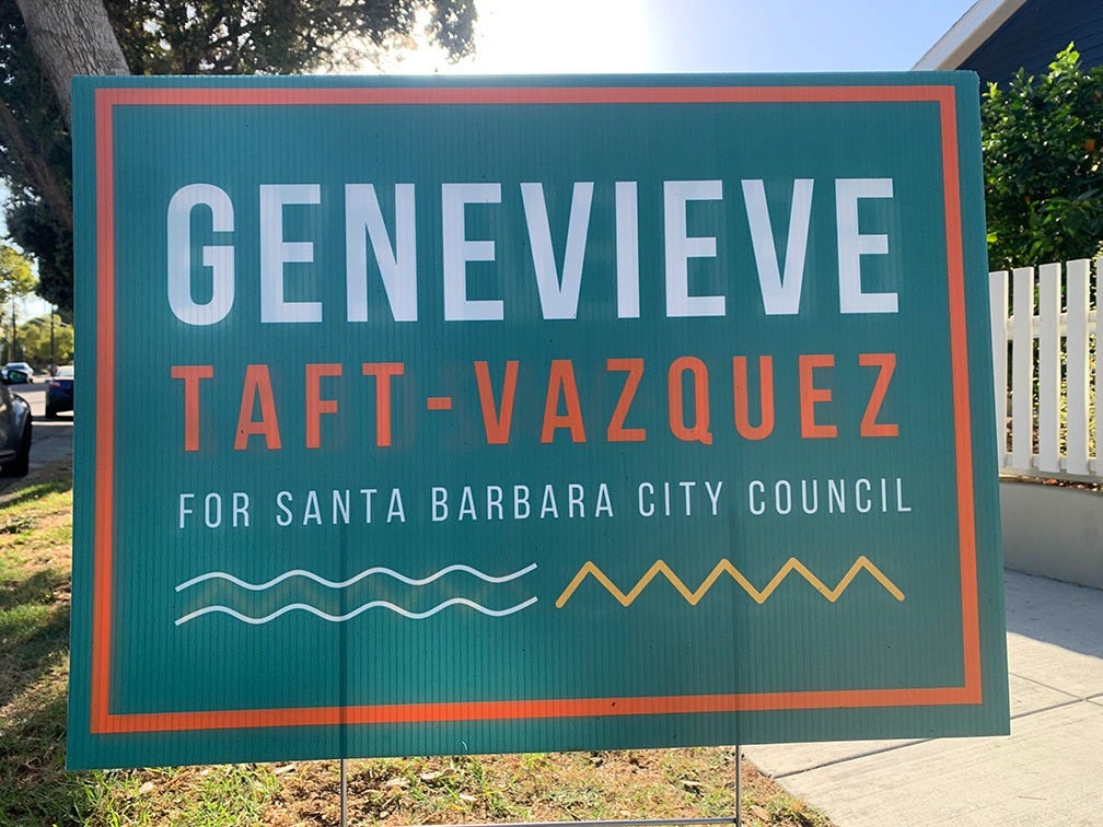
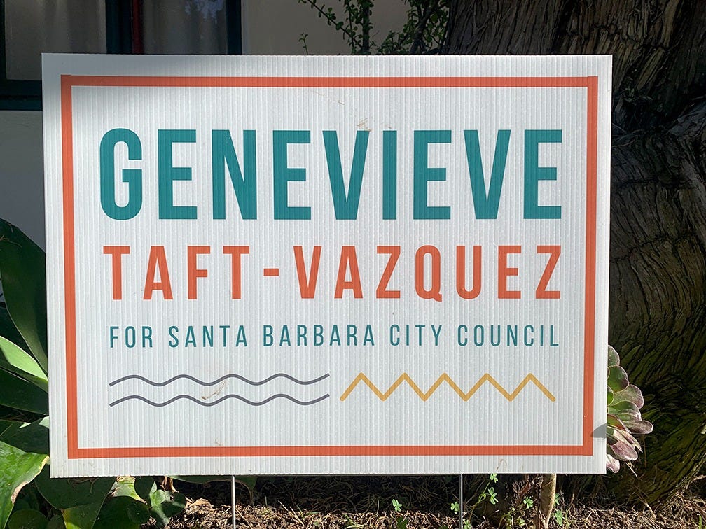
1. Genevieve Taft-Vazquez
Function: A-
Form: A
Fantastic color scheme: tile red and ocean turquoise immediately say “Santa Barbara”. The basic all-uppercase text and super literal wave and mountain icons made this design seem boring … until I saw the alternating green and white versions around town which give it an unexpected cool factor. Brilliant choice.
DISTRICT 5
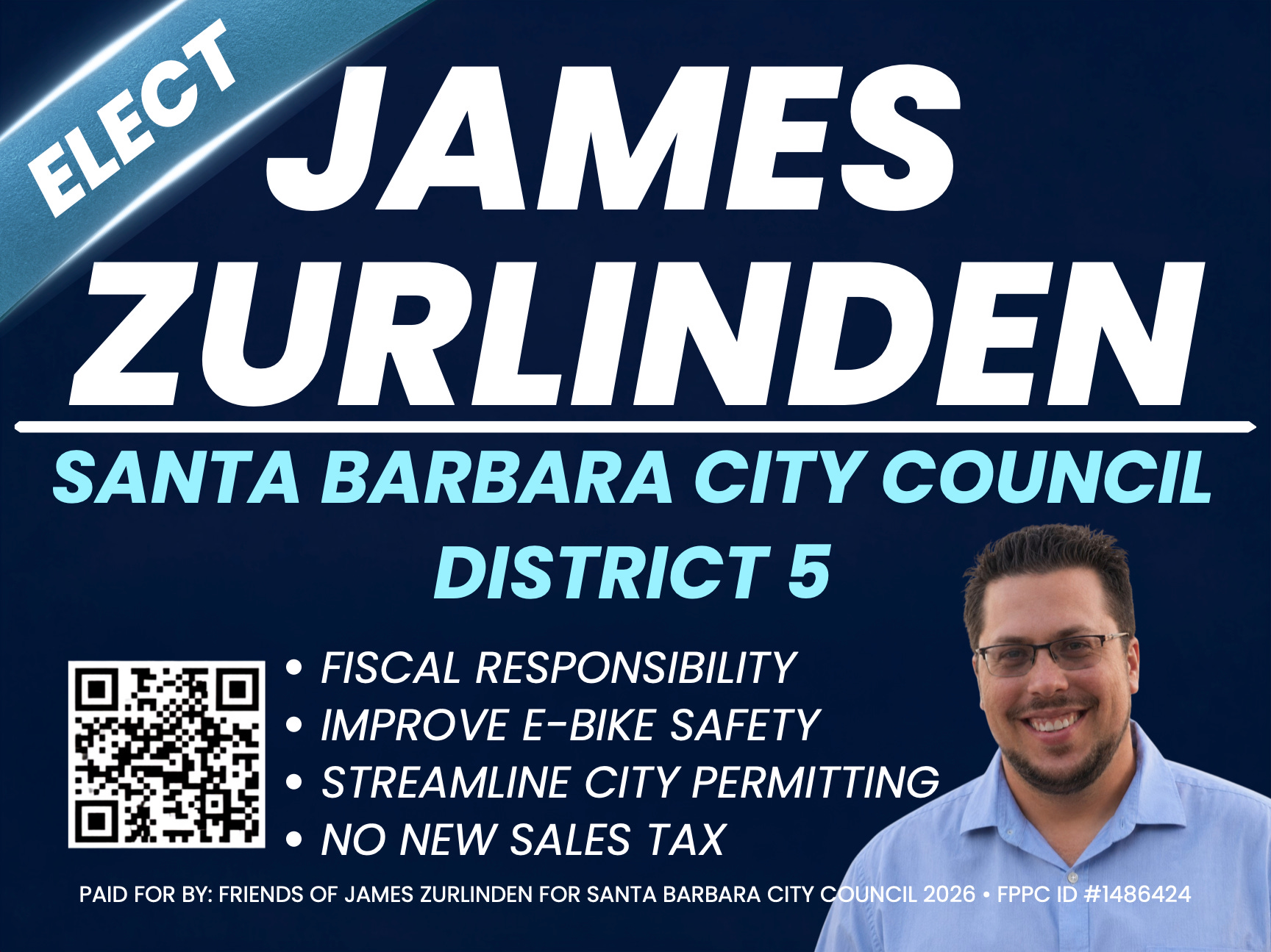
3. James Zurlinden
Function: B-
Form: C
Certainly unique -- one of only two here that include a picture, and the only sign with instructions: “Elect!” But a sign with this much information needs clearer organization and visual contrast. Why is all of the text in uppercase italics? And choose ONE blue, not three.
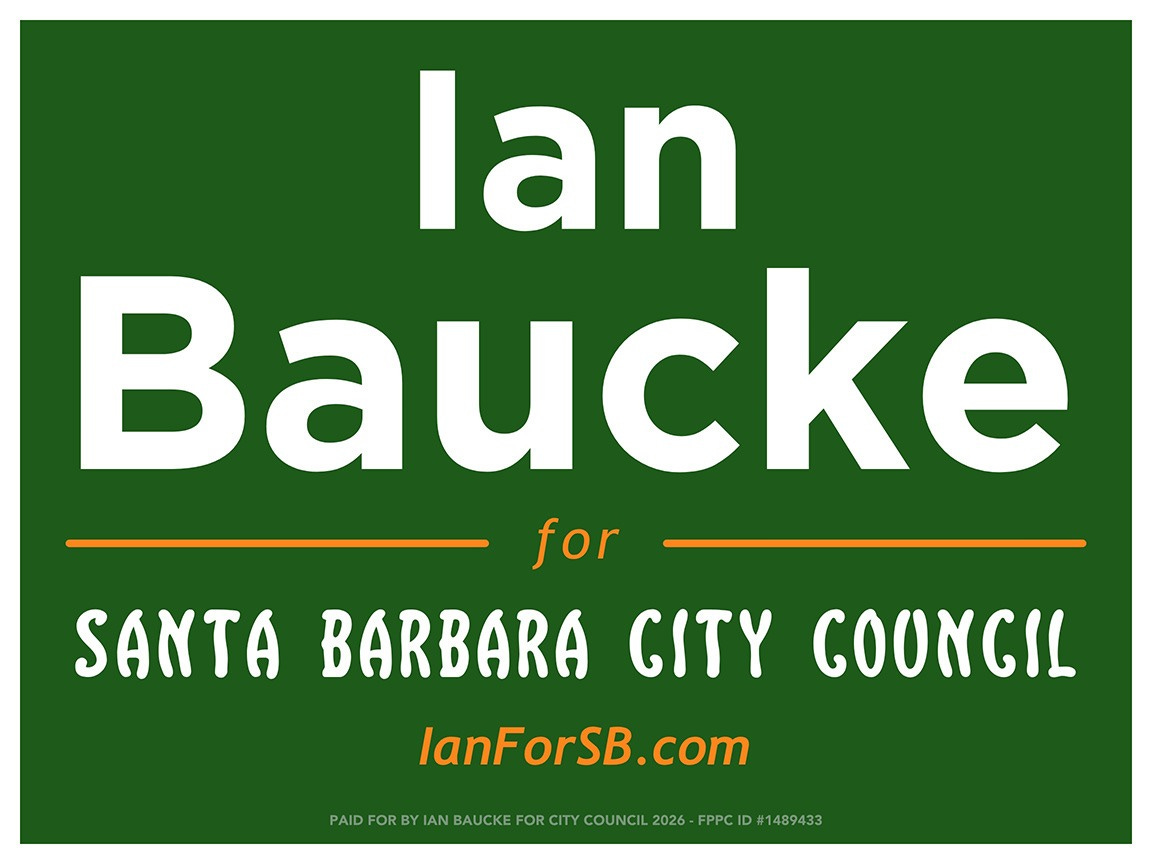
2. Ian Baucke
Function: B+
Form: D
Feels like a first pass that needs more attention to detail. It’s easy to read, but the letters in his name are spaced far apart, and the web address looks like “IanF orSB”.
The use of the street sign font here feels like a quick way to “make it Santa Barbara” but it looks fussy and lumpy next to the plain geometric font.
The color scheme is making me nauseous. If the orange was chosen to remind us Ian has a twinge of the ginge in his fringe, that’s smart branding. But combine it with ANYTHING other than forest green.
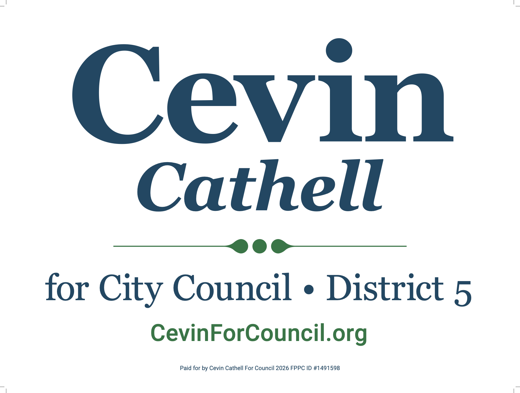
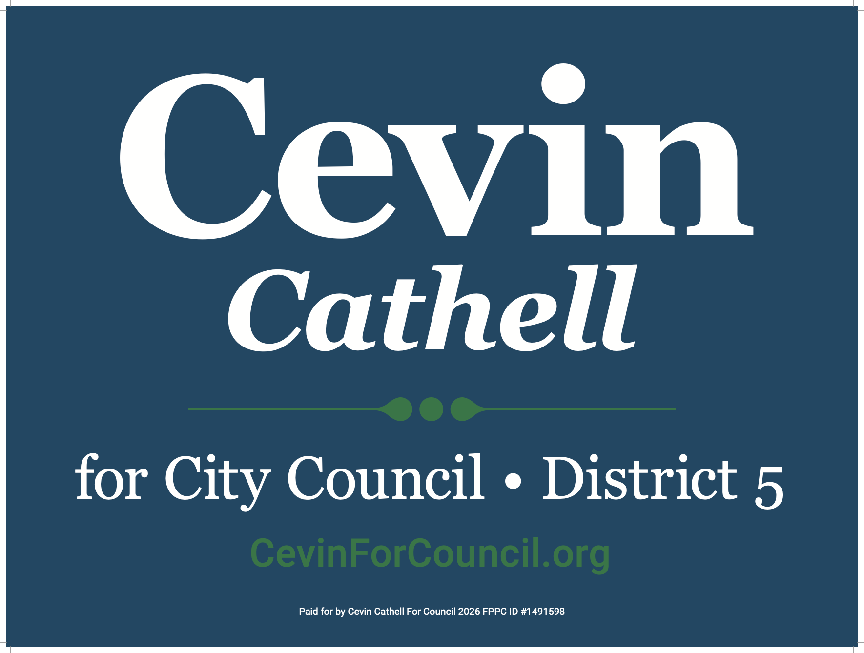
1. Cevin Cathell
Function: A-
Form: B
This sign has a great hierarchy of information, nice type contrast, includes nothing unnecessary, and is (mostly) easy to read. Buuuut it also completely lacks any personality or local feel. It looks like someone went on Canva and searched for “political yard sign” and said “this’ll do”. And it did.
Like Genevieve, Cevin tried making dark and light versions, but these are less successful. Neither is interesting, and the green text is invisible over dark blue.
DISTRICT 6
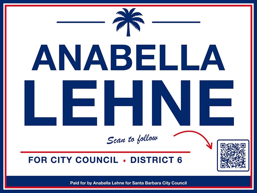
4-Annabella Lehne
Function B
Form B-
This one started well but needs some refinement. Her name jumps out and is readable from afar, but everything else is fighting for attention. Better color use could help: why are some divider lines blue and others red, and why is “scan to follow” so far away from the arrow and in a different color? Does it really need two border stripes? I do love the little palm tree -- that’s a fun touch that keeps it from looking exactly like Priority Mail boxes.
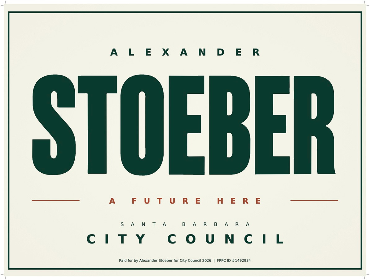
3-Alexander Stoeber
Function A-
Form B
Forest green looks great here paired with cream and brick red. His last name is so big, bold and serious compared to everything else. And I’m not sure what “A future here” means -- is he saying if he’s elected he will stay in town? Is this a threat? I’m frankly a little scared of (alexander) STOEBER.
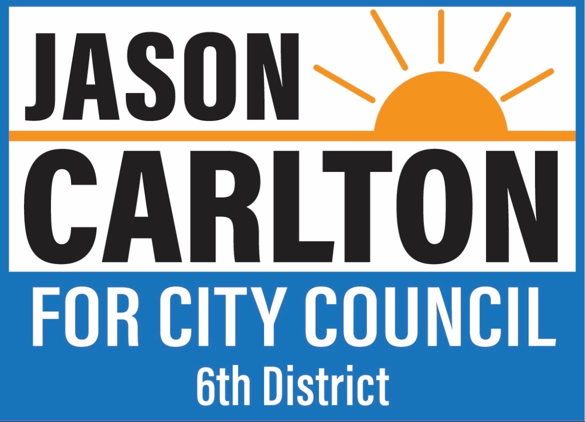
2-Jason Carlton
Function A
Form B+
Bold and effective. You can read it from a mile away, and the sun and reversed-out text on the bottom are just enough to keep it from being boring.
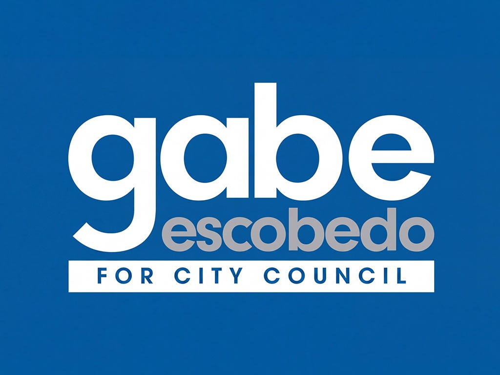
1-Gabe Escobedo
Function: A-
Form: A-
Now this is a cool take! The big all-lowercase “gabe” is friendly, readable from afar, and unlike any other sign in town. My only notes are “escobedo” is spaced too tight, and the gray is tough to see against the blue. Swap it for yellow or orange? Could use more info: which district are you running in? Do you have a website? We like your sign, tell us more.
MAYOR
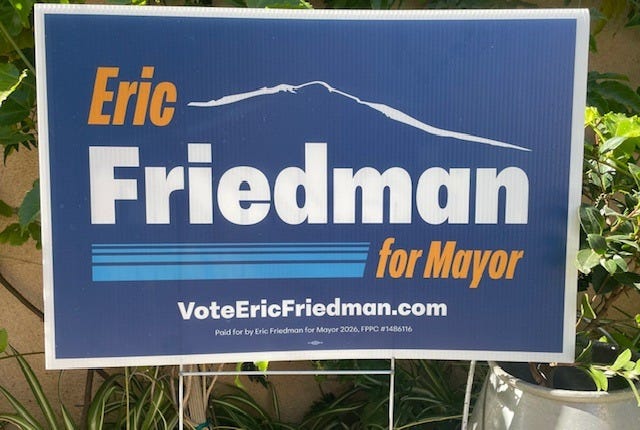
3. Eric Friedman
Function: B
Form: C
This is a perfect example of a “why” design. Why are those two words in orange and italic? Is there snow on the Santa Ynez mountains?? Why so much space between “Eric” and “Friedman”? Why suddenly blue stripes? Trying to make everything stand out means nothing does.
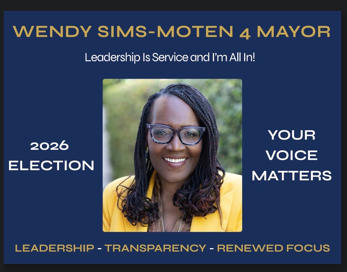
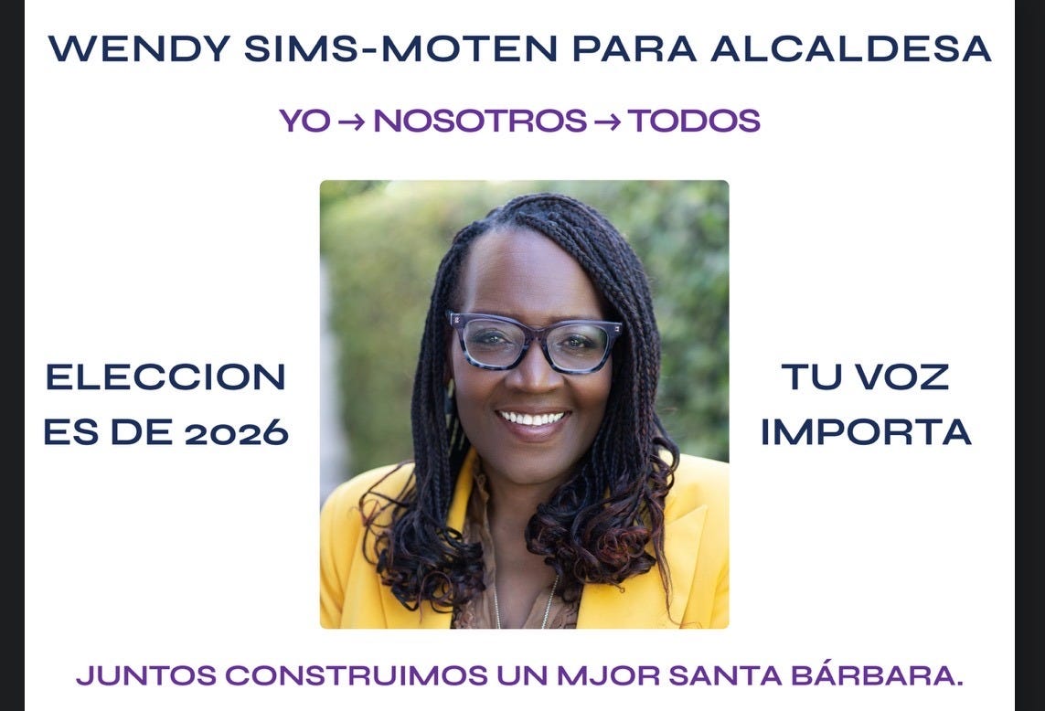
2. Wendy Sims-Moten
Function: C+
Form: B
The name is so small, and the dark gold text disappears against navy. Why not mirror the bright yellow of her jacket?
I appreciate seeing her motto and values, but “leadership” is there twice, and “2026 election” is unnecessary. Bonus points for making a version in Spanish! More candidates should do this.
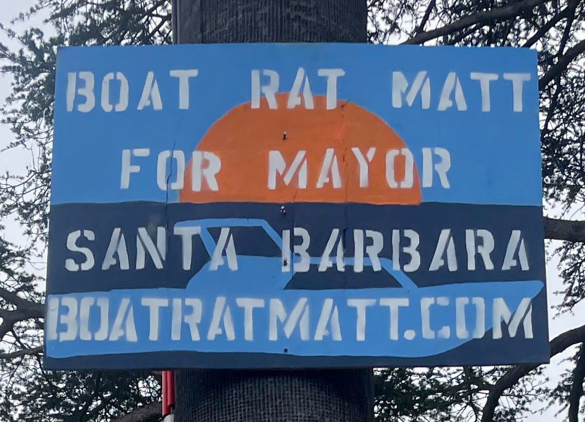
1. Boat Rat Matt
Function: A
Form: A
Instantly recognizable, simple and effective. Gorgeous color palette, which the white type stands out against. I love that each sign is individually handmade, like a little work of art. And it even gets a boat in there to support the concept! Though maybe if he didn’t call himself “Boat Rat Matt” he would have a better chance of being elected. Maybe.
Alright, I’ve had my say, now you can let me have it...
Ineligible for the Power Rankings: How Kristen got her signs
Although I’ve snarkily commented on everyone else’s yard sign designs for years, this was my first time creating one. So the pressure was on.
My first idea took inspiration from Mamdami’s New York City mayoral campaign, which had a hand-painted signage look and color scheme that felt 100% NYC.
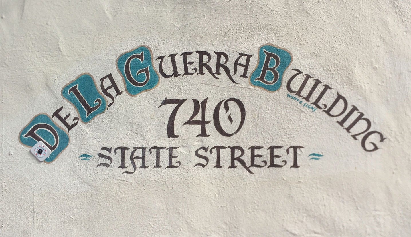
I wanted to try the same approach in Santa Barbara, using the hand-painted lettering from our city buildings with ocean turquoise and red-tile-roof colors.
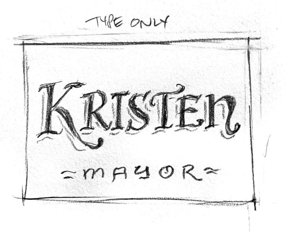
My second idea was to do something cool with a palm tree or mountain range.
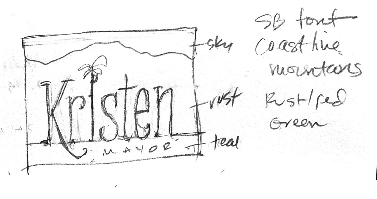
Kristen liked both concepts, so I did some mockups using fonts I often see around Santa Barbara. Do you recognize any?
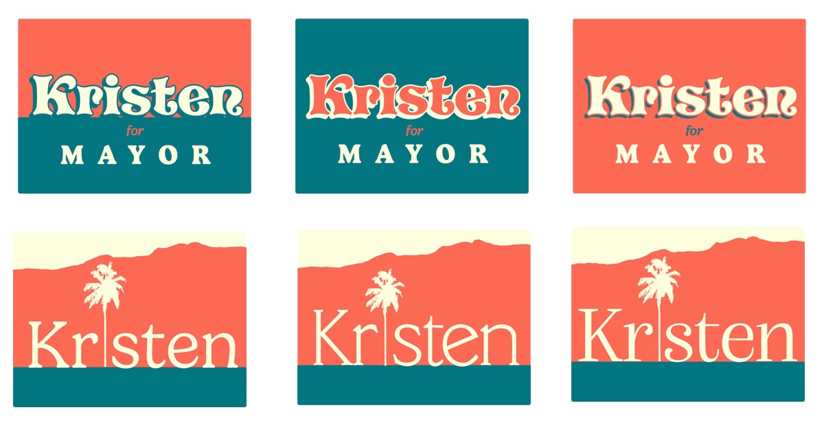
As is often the case, my grandiose plans came up against the practical concerns of those with actual experience in the realm. No problem – the designer’s job is to find the sweet spot of art and practicality.
Kristen and her team asked for something simpler, with emphasis on “Sneddon” instead of “Kristen”.
Type-wise, serif fonts are back in fashion, so I pushed for that to stand out against other signs in sans-serif.
One of the fonts I tried above had an S that looked a lot like SB sign lettering, so I used that as a large “drop cap” with a curvy shield shape behind it.
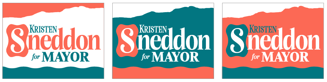
They liked the type, but decided it should look more like her previous campaign sign for familiarity.
Fortunately the colors were similar, but what was that wavy line supposed to be? Ocean waves? Mountains? A stray piece of ribbon?
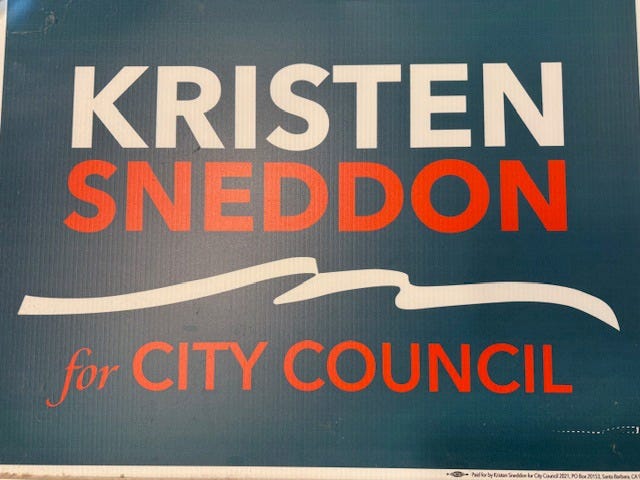
I put my type and colors into that layout, extended the wavy line past the edges of the sign, and tried lots of color options and combinations of upper and lower case lettering.
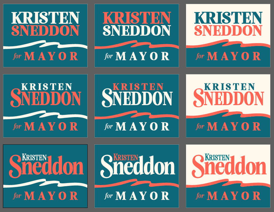
Everyone liked the version with green ocean/mountains on the bottom, a ribbon of sunny orange in the middle, and white top where the colors really stood out.
With a few tweaks, we had it!
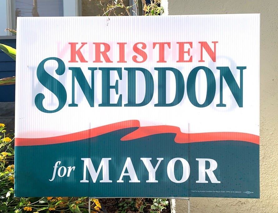
The final design is far different than I envisioned, but I’m really happy with how it turned out. It’s easy to read, and the color combo and curvy “S” give it a distinctly Santa Barbara flair.
Don’t forget to vote!
Lead image: Josh Molina for Santa Barbara News-Press.
Didn't agree with all the verdicts but really liked the comments and the process. Very interesting.